Cooking Roulette
Tea themed event concept - a feature for Merge Mansion
Cooking Roulette
Tea themed event concept - a feature for Merge Mansion
Project Context
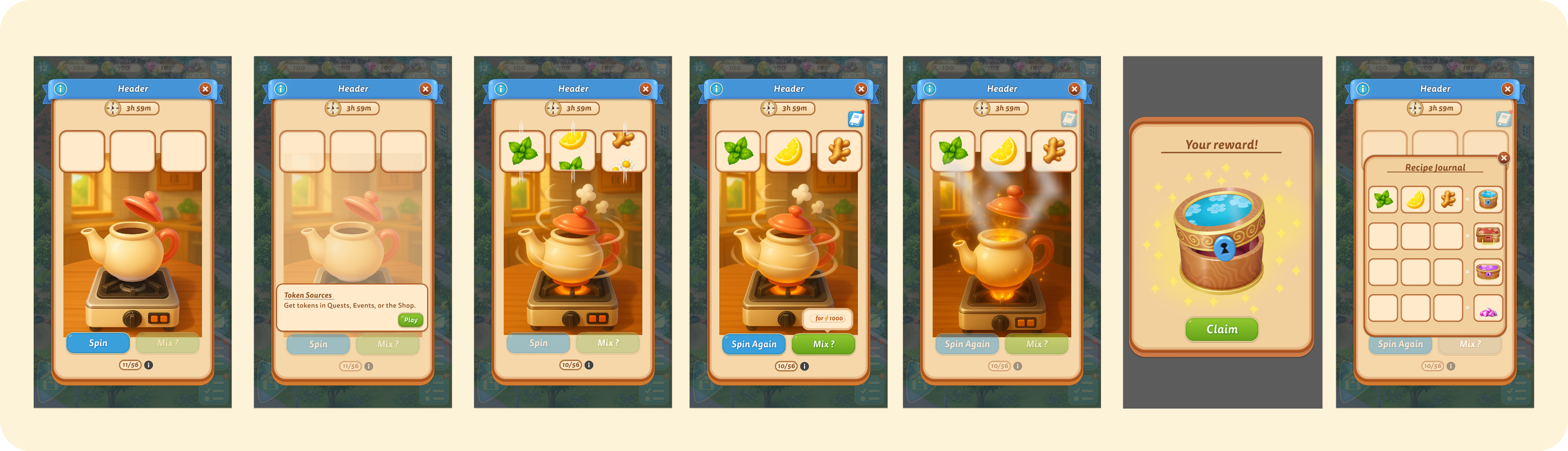
This case study explores the design process behind Cooking Roulette, a cozy, tea themed limited-time event concept for Merge Mansion. The feature is built around a warm, polished interface designed to feel like a real in-game event, where players spin to collect ingredients, mix them into tea blends, and claim rewards.
The project involved designing a complete spin-based feature within Merge Mansion's established UI framework. While existing in-game components informed structure and integration, the feature's core elements, including the teapot, ingredient icons, recipe book, reward states, and blend combinations, were designed from scratch to fit seamlessly into the game's visual style.
To give the feature its own identity, I introduced the teapot as the central interactive element, a friendly, cozy metaphor that fits naturally within the game's universe. The teapot became the heart of the experience, representing both player progression and the magical act of "mixing" ingredients.
Players spin to collect ingredients, spend energy to mix them, and unlock unique tea blends and rewards. The deliverables included full user flows, wireframes, UI layouts, animation states, and reward moments.
Design Goals
Design anchors for Cooking Roulette, aligned to Merge Mansion's visual language.
- Create a warm, and cozy, interface inspired by Merge Mansion's visual world.
- Guide players naturally from spin → mix → reward.
- Make ingredients feel rewarding and exciting through clear, engaging interactions.
- Build flexible UI components that could scale as a real, game ready system.
- Integrate an original design concept (the teapot) that visually connects all steps of the experience.
My References
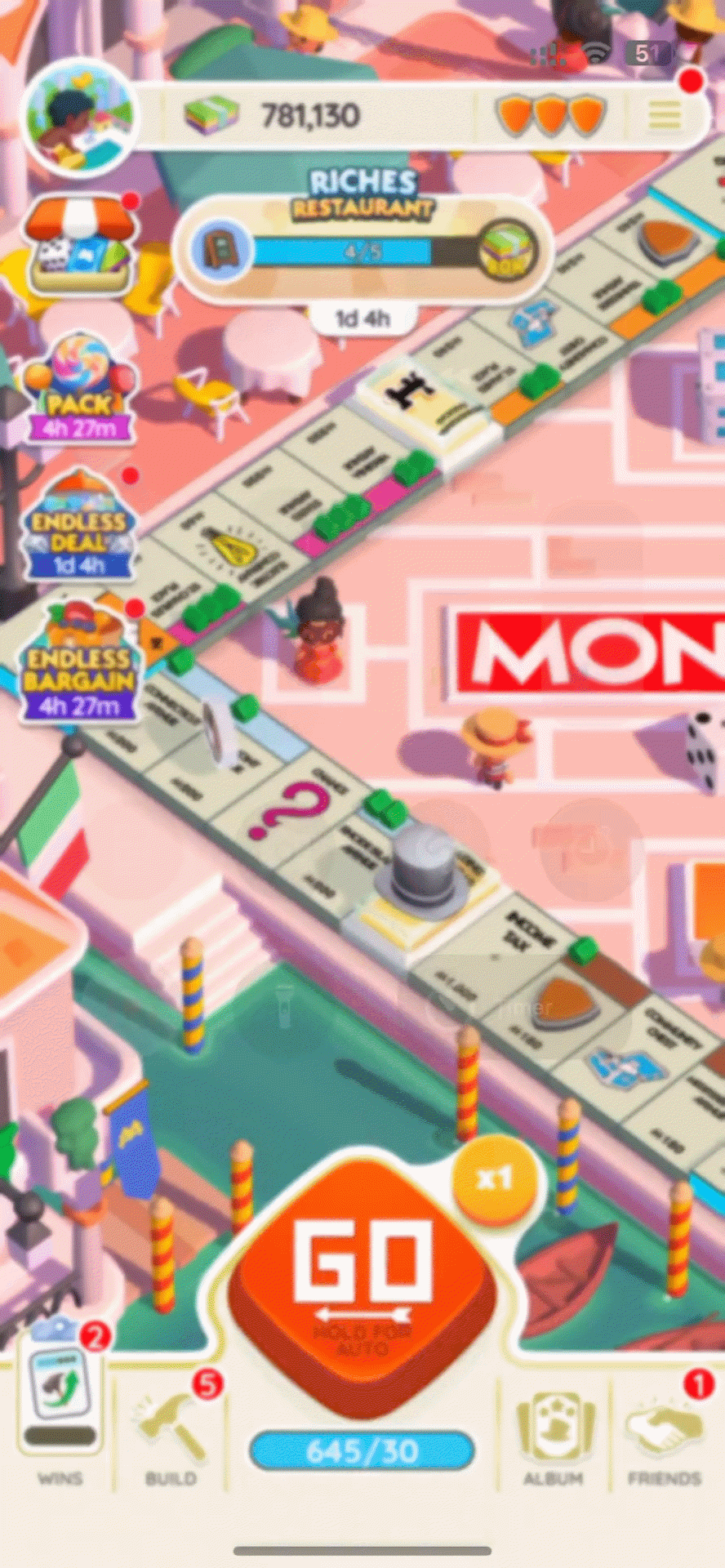
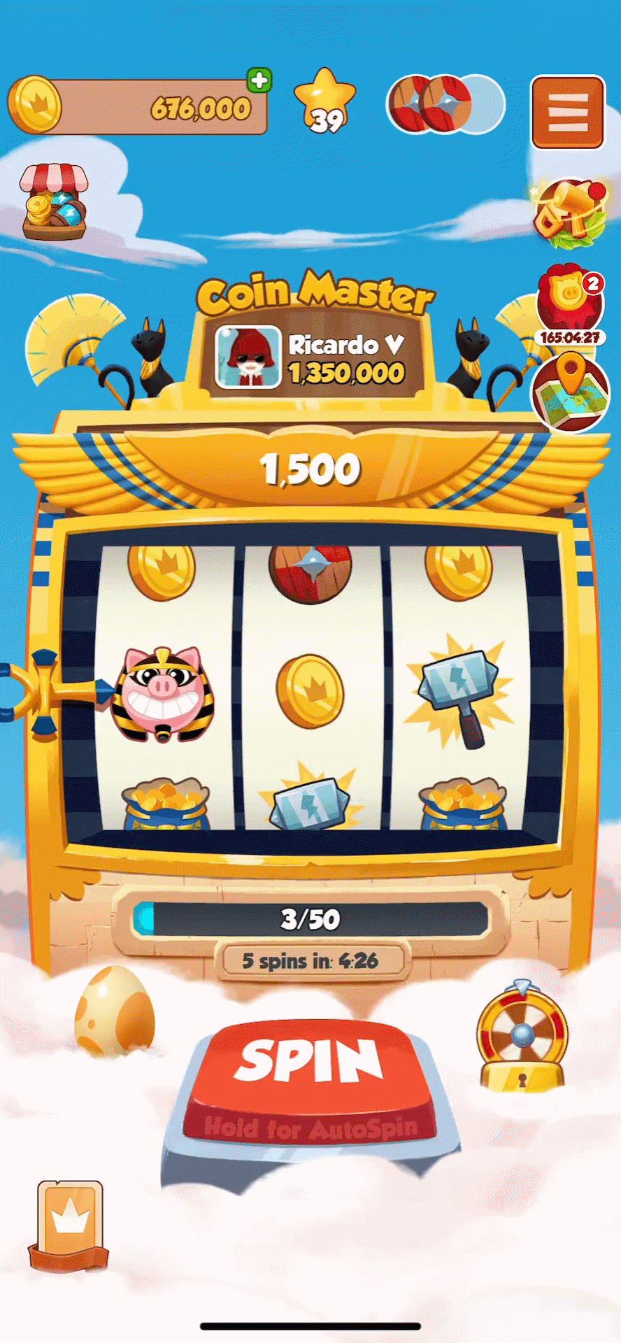
I studied Monopoly GO and Coin Master to understand how spin mechanics create anticipation through a tactile button press, followed by a moment of suspense and a celebratory outcome. What stood out was the clarity of the interaction loop: Press, wait, reveal, and how animation and feedback make each action feel intentional and engaging.
User Flows & Wireframes
I began with grayscale wireframes to map hierarchy, readability, and pacing.
My goal was to keep the process simple: Spin → see ingredients → mix using energy → claim reward.
I explored multiple wireframe layouts to test hierarchy and call-to-action placement.
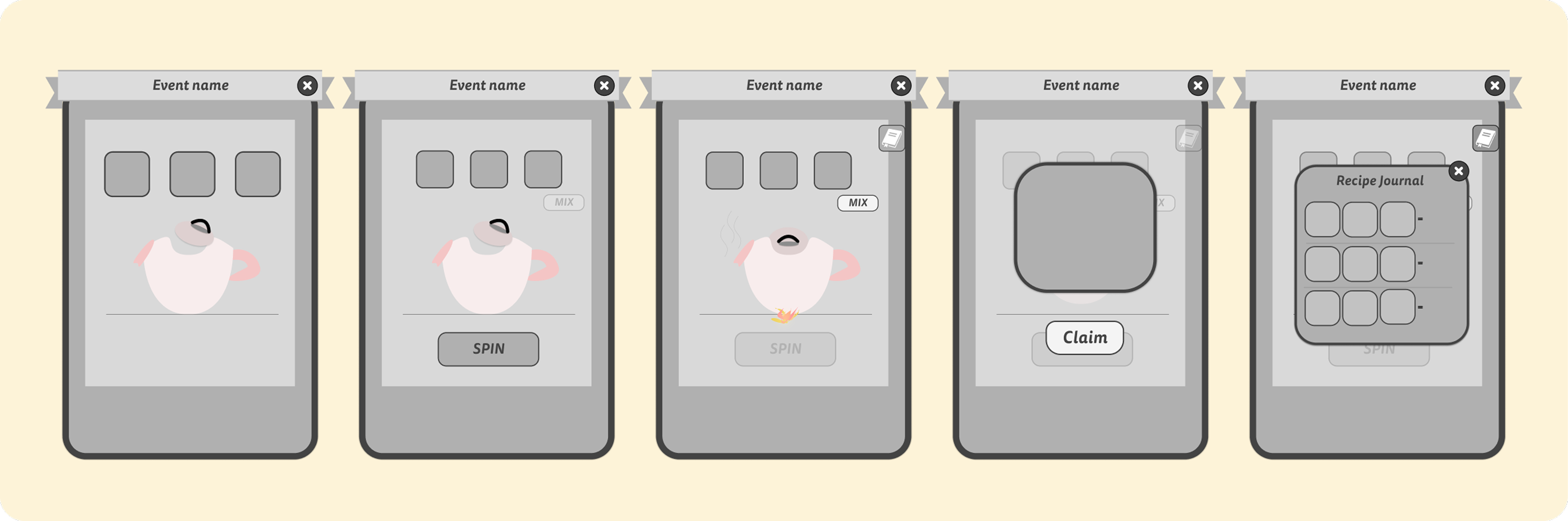
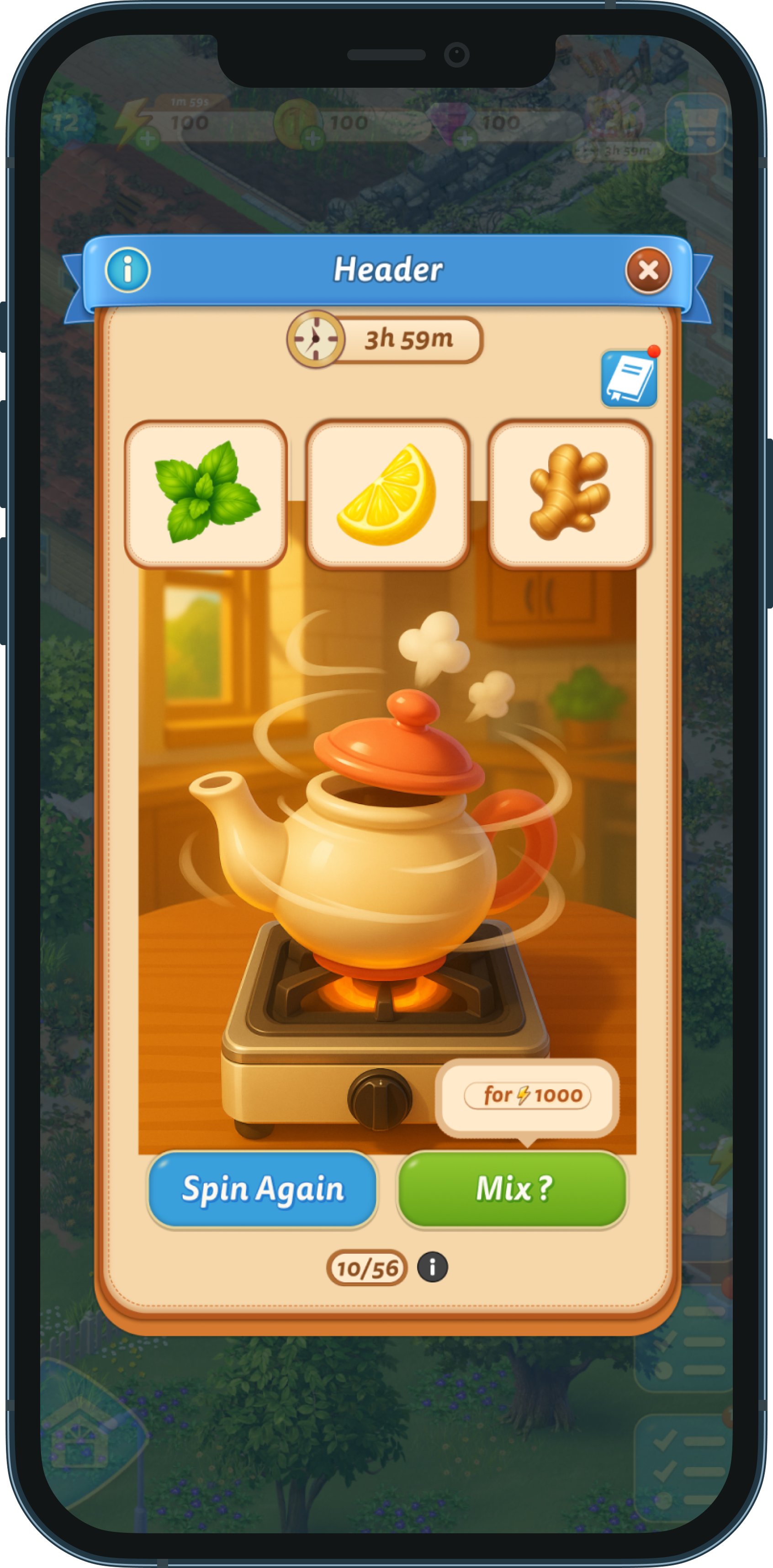
Designing the Spin→Mix→Reward Flow
Designing Cooking Roulette required several rounds of iteration, especially in shaping how the player transitions from spinning → mixing → receiving a reward. This sequence became the core of the feature, and I dedicated much of the process to refining the structure, hierarchy, and clarity across each step.
I began with very simple grayscale wireframes to map the essential journey: Spin → Reveal Ingredients → Mix (Energy Cost) → Reward → Recipe Journal
These early layouts focused purely on functionality. Where the teapot sits, how ingredients are displayed, and how the user progresses from one step to the next.
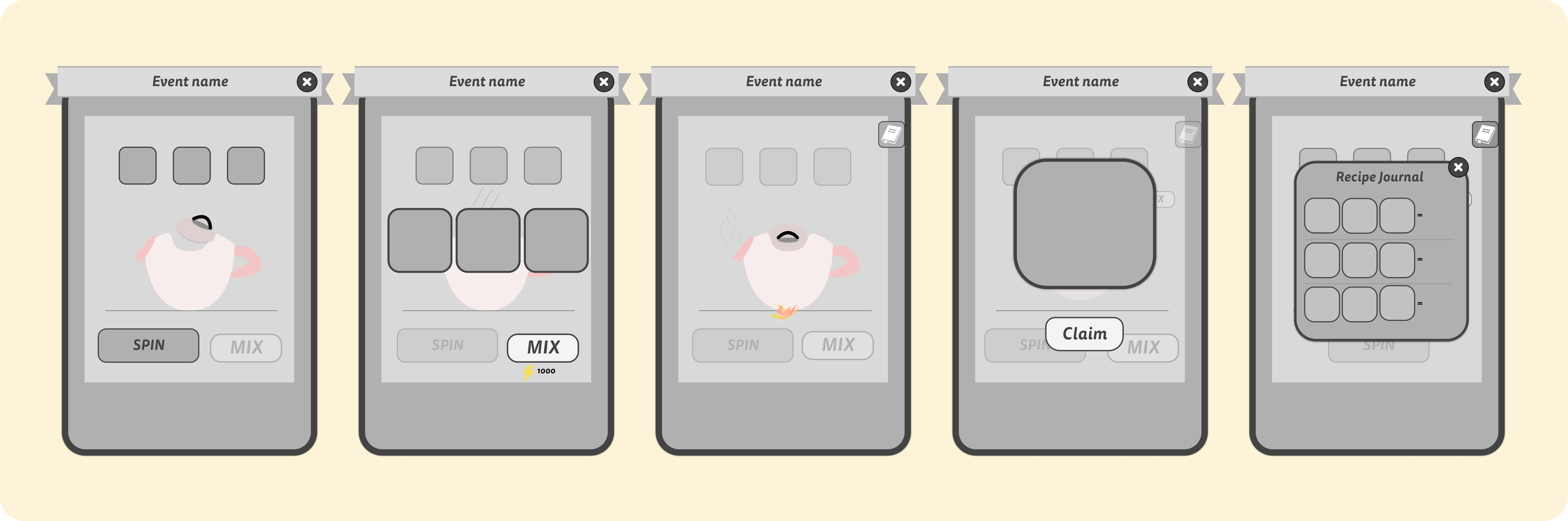
As I moved into mid-fidelity wireframes, I iterated heavily on:
- Ingredient tile size and spacing
- Mix button placement and visibility
- How and where to attach the energy cost
- Guiding the player naturally from action to action
Across these versions, I tested multiple configurations to ensure the next step always felt obvious without crowding or overwhelming the UI.
Refining the CTA Hierarchy
One of the biggest UX challenges was deciding how to present Mix and Spin Again.
I explored several placements:
- Under the ingredients
- Inside a popup
- Bottom-right with cost separated
- Bottom-right with cost attached directly
- Dual-CTA rows with both actions visible
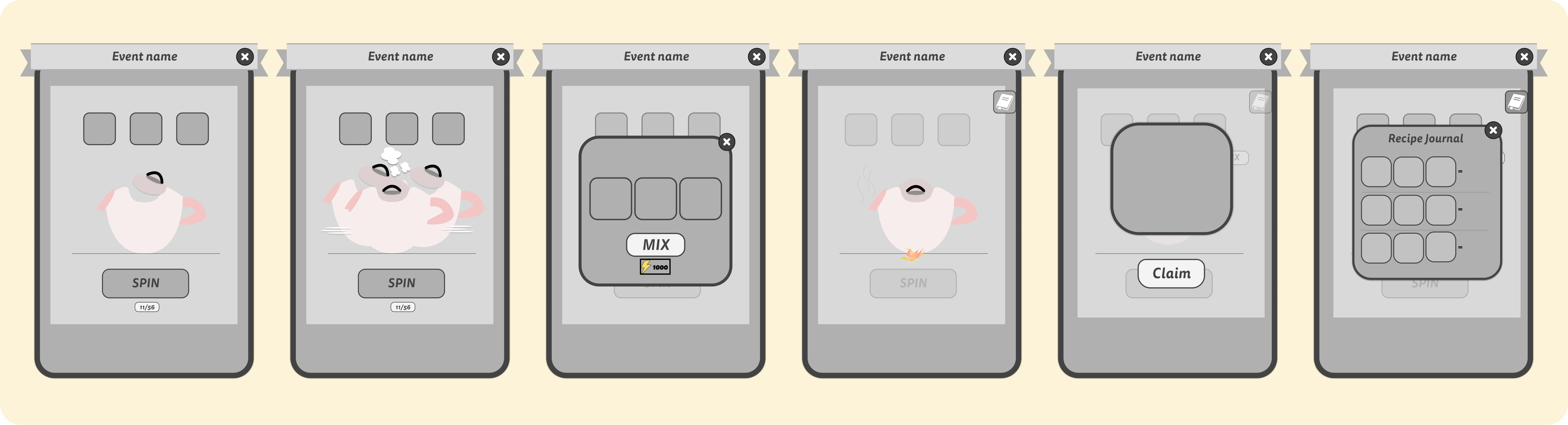
Layout & Structure
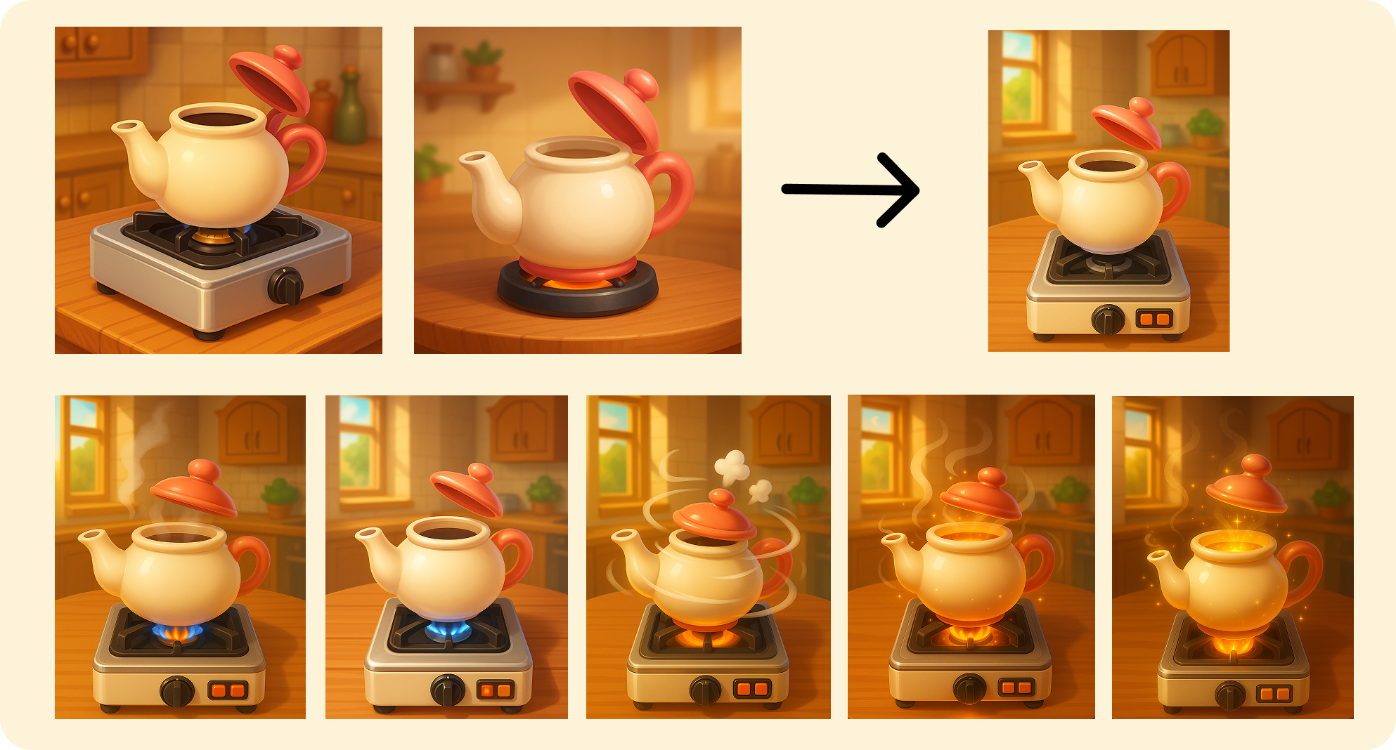
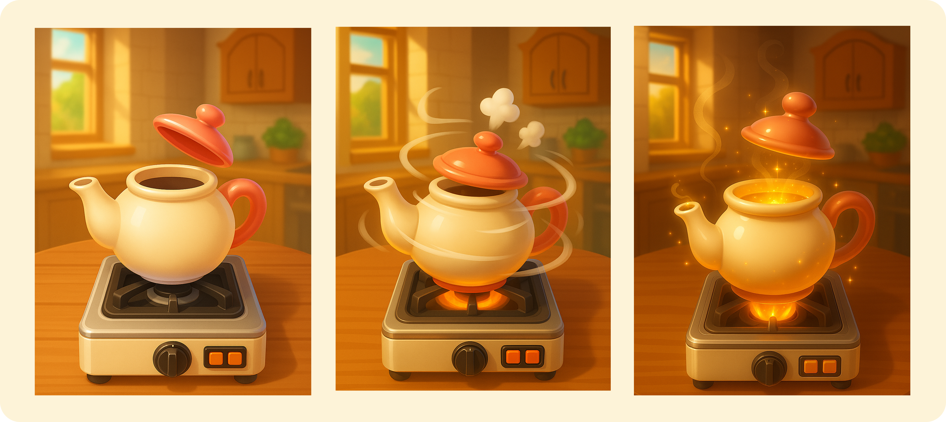
The teapot became the central storytelling element of the feature. A warm, familiar object that communicates mixing, discovery, and progress at a glance. I wanted it to feel both functional and character-like, matching the cozy atmosphere of Merge Mansion.
I explored many visual directions for the teapot, using an AI-assisted workflow to experiment with shape, lighting, lid positions, bases, and heat effects. Throughout the process, I kept the camera angle, environment, and countertop consistent so every state would feel cohesive when placed inside the UI.
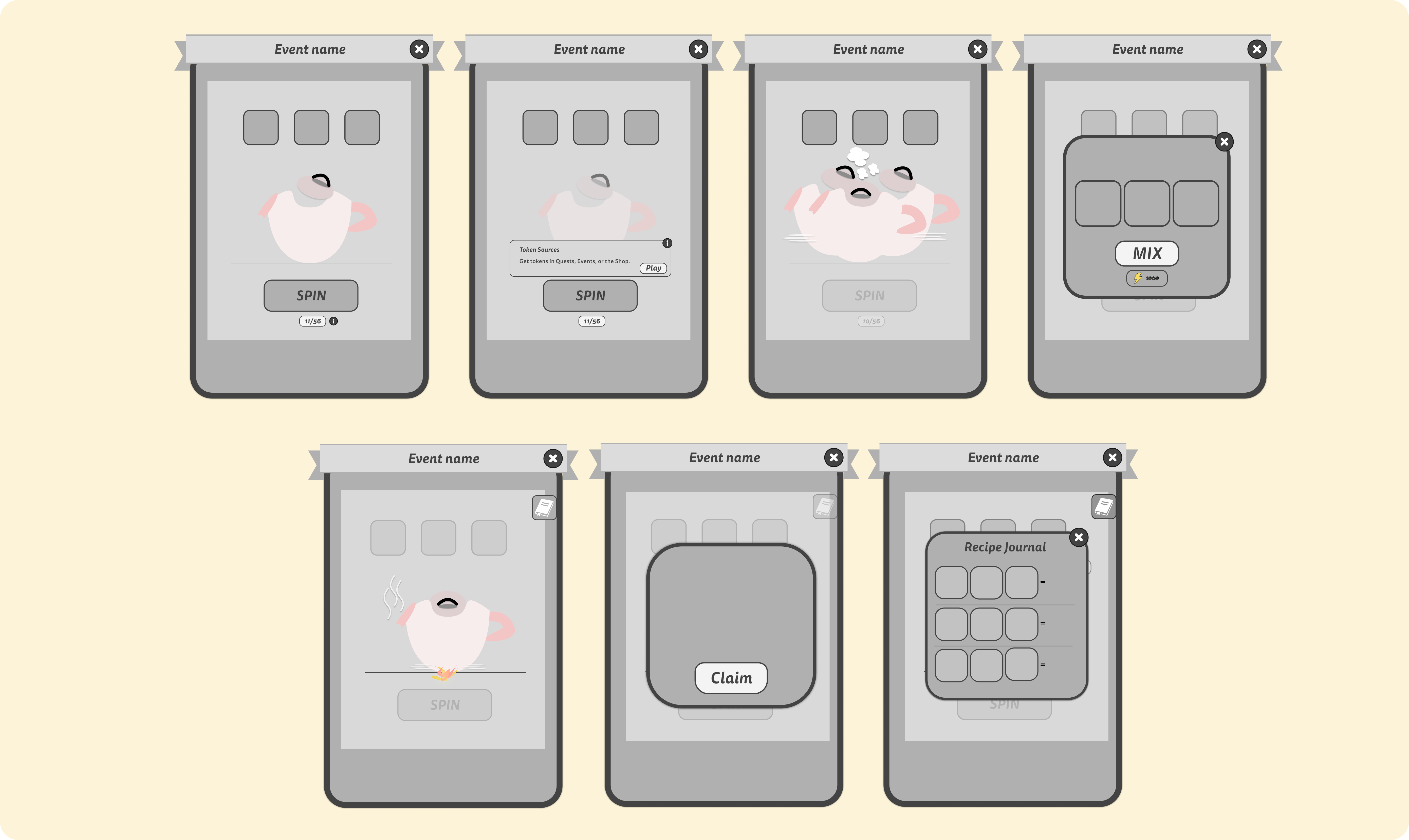
Final Illustration Designs
The final UI includes:
- Main Screen – Spin and collect ingredients
- Post-Spin Screen – Ingredient results, mix and spin options
- Mixing State – Energy use and brewing animation
- Reward Screen – Chest opening moment
- Cooking Book – Collection of discovered blends
All screens share the same cozy tone, lighting, and structure for a seamless visual flow.
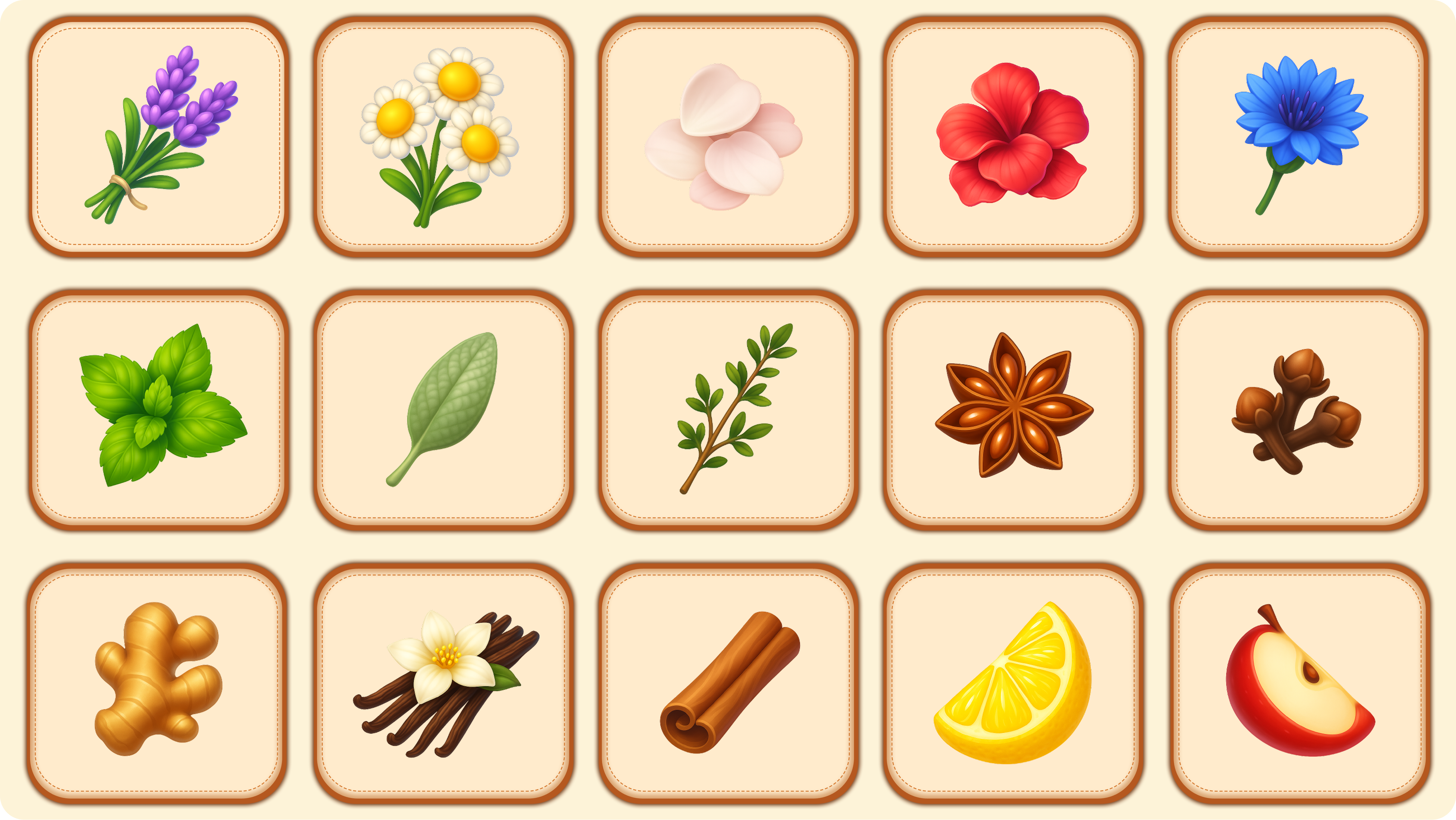
Visual Language & Icon System
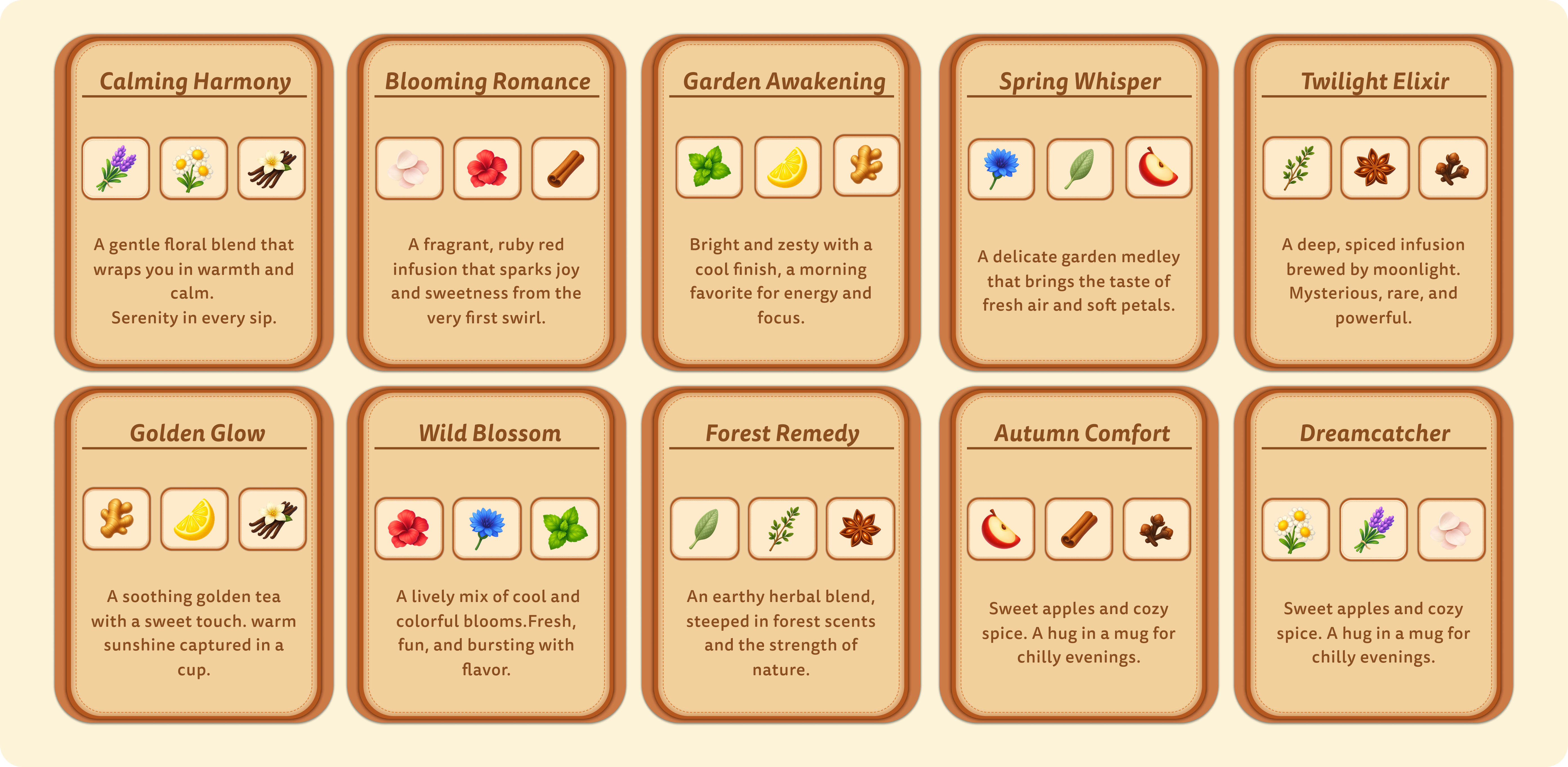
The art direction combines semi-realistic detail with soft, cozy charm. Each ingredient icon: Lavender, Chamomile, Hibiscus, Mint, Cinnamon, Lemon, and others, was created from scratch, inspired by Merge Mansion’s polished lighting and rounded shapes.
To ensure consistency:
- All icons share a light beige background
- Use smooth gradients, soft shading, and gentle highlights
- Feel collectible yet readable at small sizes
Typography & UI Decisions
To ensure the feature felt fully integrated into Merge Mansion, I adopted the existing typography and button styles from Metacore’s asset library. These elements act as the visual foundation of the game, so keeping them intact preserved consistency and authenticity.
Around that foundation, I designed the rest of the experience from scratch. The frames, icons, teapot states, layout structure, reward cards, and all interaction flows were built to complement the established style while introducing a fresh, cozy aesthetic unique to Cooking Roulette. This approach allowed me to expand the visual language in a way that feels new, yet unmistakably part of the Merge Mansion world.
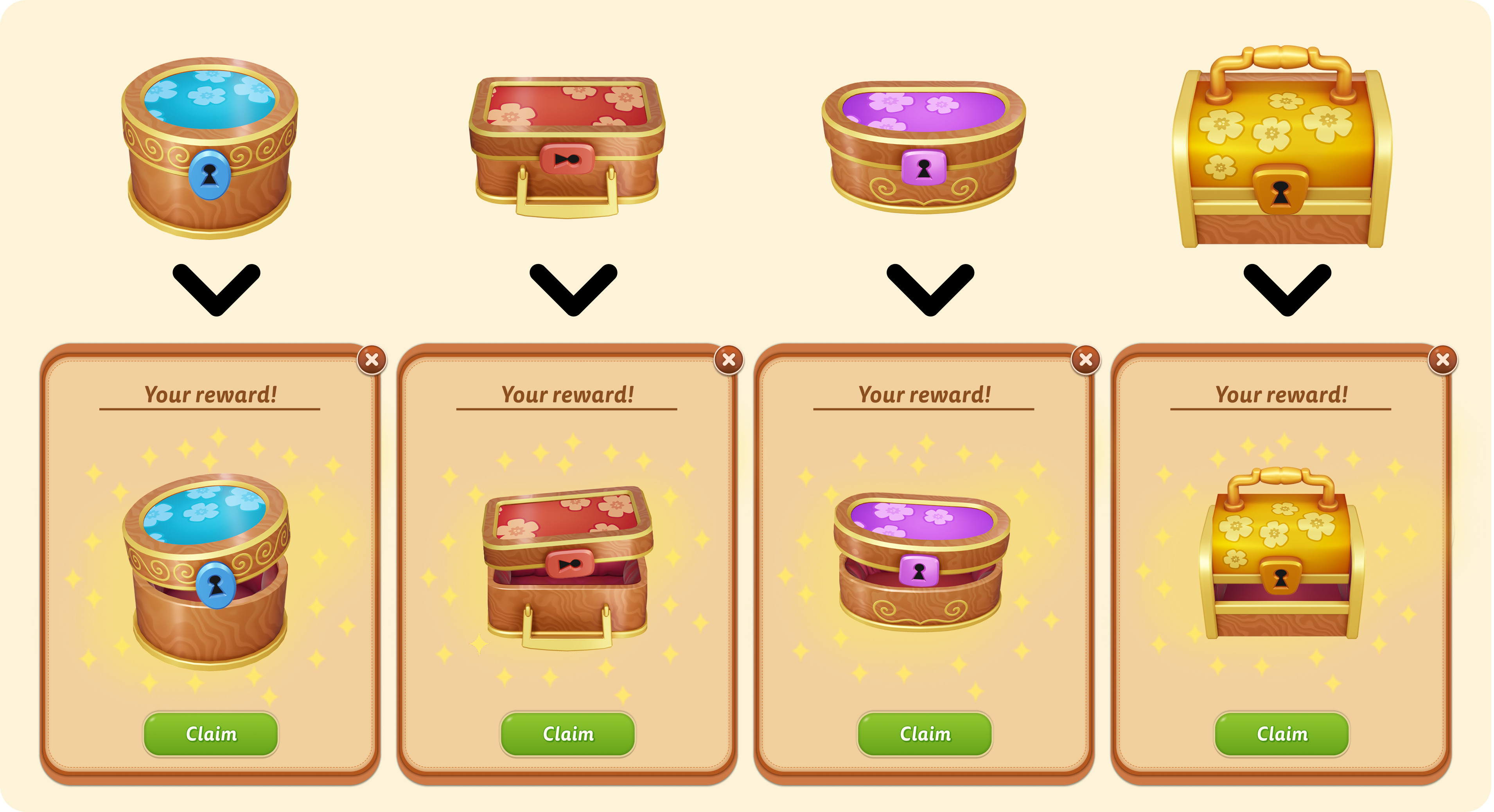
For the reward moments, I took the existing closed chests from the Metacore's asset library and redesigned them in an opened state to create a more celebratory reveal. Instead of simply reusing the original icons, I added lifted lids, warm rim lighting, sparkles, and subtle shading changes to make the chests feel alive and full of anticipation.
Additionally, I created optional recipe cards to give each tea blend its own story and description, adding a layer of charm and collectibility to the experience.
Final UI
Cooking Roulette was a chance to combine UI design, art direction, and UX thinking in one cohesive challenge. Working with real Merge Mansion assets taught me how to respect an established style while introducing new ideas that expand the world in a believable way.
Introducing the teapot as the feature’s core mechanic gave the experience its own visual identity, cozy, magical, and distinct, while staying fully aligned with the game’s brand. From icons to interactions, every design choice supported one goal: to make the feature feel alive, satisfying, and genuinely fun to use.